Final Portfolio

Process: I started out by opening up Powerpoint and putting all of my past projects on different slides. I had to resize them all because we have made some pretty big projects throughout this semester. I then chose a color scheme of red and gold and decide on what the design of the slides would be. I tried to line up all of the photos on the middle of the large gold line to give the slides a more uniform look. The message of this is that you should hire me for your company. The audience to a future employer that can look at my online portfolio and see some of the work that I have done. Hope you enjoy seeing my work from the semester!

Critique: I was able to hear from Zoe and from my mom this week. It’s kind of nice being a concurrent enrollment student and having my mom here to help me. She told me to change up the subheader font on the first and last slide. She also told me that on the movie poster slide that I had some alignment issues. Zoe is one of my closest friends and she has been able to help me so much this semester. She told me that I needed to change the first and last slide so that they stood out a bit more. I added the red box on top of those two slides and I think that it really helped them to stand out. She also caught an alignment error, but this one was on the magazine layout slide.

Magazine Spread Project

The first step was to make some sketches and then decide which one I liked best. We did this a couple of weeks ago and it was really nice to be able to have some work already done for this project. The next step was the shape map and that really helped me to be able to see what sort of design I wanted to end up with. I said a bit about the color that I wanted and I decided my fonts at that stage. sketchesshape map2

Below is the final project! I changed it a little bit, but the basic idea stayed the same. The audience was still new era aged kids since the story was of me when I was 17. The message is that you really can change a persons life even if you aren’t trying or you don’t think you really have an influence on the people around you. I feel like it turned out really well and I hope you all like it!

12ACardstonStanford

Critique: I was able to get Zoe to look at my project again. She said that I should make the text wrap around the planet and I think that it really helped. She also said that the blue that I had the title in was too close to black so I brightened it up. My mom also helped me a lot. She helped me size the size the planet and decide where to place it. They really helped me make this a much better project.

Fonts: Title-Nasalization, Decorative. Body copy-Arial, Sans Serif

Image sources: 

Pluto- http://www.nasa.gov/image-feature/pluto-dazzles-in-false-color

Pics of me- https://www.facebook.com/Idaho-Science-and-Aerospace-Scholars-163878680351541/ 

Magazine Spread Draft Critique

The first step was to make some sketches and then decide which one I liked best. We did this a couple of weeks ago and it was really nice to be able to have some work already done for this project. The next step was the shape map and that really helped me to be able to see what sort of design I wanted to end up with. I said a bit about the color that I wanted and I decided my fonts at that stage. Here is what I currently have!

12ACardstonStanford2 Rough draft

shape map2

sketches

Fonts: Title-Nasalization, Decorative. Body copy-Arial, Sans Serif

Image sources: 

Pluto- http://www.nasa.gov/image-feature/pluto-dazzles-in-false-color

Pics of me- https://www.facebook.com/Idaho-Science-and-Aerospace-Scholars-163878680351541/ 


Web Page Layout

11ACardstonStanford

11A-ShapeMap-CardstonStanford

11A-Sketch-CardstonStanford

Process: I started with my sketch. I wasn’t sure what I wanted it to be so I just kept trying out different elements and I ended up with this design that I liked. While I was thinking of a sketch ideas I thought of a company and Canada Dry came to mind. I decided to match my colors to their colors of red and green. I then made my wire frame on Photoshop and it turned out pretty good. I found some images that looked good and started on the final design. I feel like it all turned out really well and I hope you enjoy!

Critique: It is always good to have Zoe as a coworker so we can do our critiques in person. She told me that I needed more texture since I only had the bubbles on the top. I added them to the side and it really helped. She also told me the middle was too white so I added the red lines under the titles of the the different pictures.

Color Scheme: Complimentary (Red and Green)

Fonts: Title: Elephant (Regular). Body copy: Estrangelo Edessa Regular.

Links to Images: 

Bubbles: http://www.adeevee.com/2008/04/sapporo-beverage-ribbon-citron-drink-sparkling-bubbles-sparkling-soda-outdoor/

Ginger pic: http://topfoodfacts.com/24-facts-about-ginger/

Bottle pic: https://www.meijer.com/product/grocery/beverages/canada-dry-gingerale-2-liter-bottle/t1/t1-865/t2/t2-9976/7800015246.uts

Movie Poster Project

movie poster


Message/ Audience: So I am currently working in the Idaho Capitol building as a Senate page so I wanted a government themed poster. I tried to get a good picture of the Idaho capitol but I decided to go with a D.C. theme instead. The movie would be a documentary on the boy that changed the world (me). The audience is anyone that wants to be inspired by a thrilling story of a world changing movement.  The people that will really enjoy the show are those that know me personally and those that hope to make a difference in the world.

Critique: So Zoe and I opted for the 10 minute review of each others projects again. One of our coworkers also joined in and helped. They both pointed out that I had the wrong spelling of capitol. They also didn’t like the first 100 (a bit of a hyperbole) fonts that I chose.

Fonts:  Title: Universal Serif Regular

Body: Sakkal Majalla Regular

Pictures: I took the picture of myself.

Washington Monument: http://www.history.com/topics/us-states/washington-dc/pictures/district-of-columbia/aerial-view-of-lincoln-memorial-and-washington-monument

Perspective of 12

My inspiration for this was that apples are kind of iconic in art. I thought it would be cool to see what sort of situations I could think of to put an apple in. I went all over my Uncle’s house and all over the Idaho State Capital building where I work. I really liked the picture with the other fruit in the background and I also like the one with the capital in the background. I am not a photographer, but I feel like I was able to capture the apple in a couple of new, creative ways. The piano picture for instance was one I thought of on the spot and I thought it was a very creative shot. Zoe and I used the option to only do one critique if you meet in person and spend 10 minutes critiquing each other. The big thing was that I had a typo. She also gave me some ideas for new shots since one or two of mine weren’t that good.

I hope you all enjoy!

photos of 12

apple blend

IMG_3433

IMG_3437 (1)

IMG_3443

IMG_3447

IMG_3448

IMG_3440

LFC Photography Activity

Outside light
Outside light
Inside light
Inside light
Foreground
Foreground
Background
Background
Thirds
Thirds
Lead room
Lead room

Photography is not my favorite thing to do. This project was a bit of a struggle for me and I had a pretty hard time with getting pictures that I hope fulfilled the requirements.

With my pictures, I tried to get the full view of what is like living with my Uncle as he remodels his house. The outside one is a photo of his house. In the indoor one I got a photo of my cousin’s work shoes. The near to far is of a bush outside then it looks onto the cars in the street. The rule of thirds shows my cousin’s bikes that haven’t been rode in awhile because of the construction. The last one of the leading image is my Uncle painting a wall. I hope you enjoy.

Light room was pretty easy to use actually. It was cool to watermark them and edit all of them in the same place.

Social Media Marketing Project

Company: Old Spice

Objective: Get more people to buy deodorant.

Strategy: I will create an Infographic about using deodorant that shows that you are more likely to get the girls if you wear deodorant.

actual

Process: So my first thought on this project was to do Old Spice. They are a great company and their ads are so random that I could do whatever I want. The audience is of course men and I want the message to be that to wear deodorant, but just like Old Spice I am saying it in a very random way. I was thinking of an Inforgraphic I could do and one of the Old Spice commercials inspired me. In the commercial the character tells the ladies to look at there man and then back at him. This made me think of doing lines that lead people through it. I have never seen an ad like this before, but I have seen other yes/no charts that lead people through them. They are usually for things like which book character are you and it leads you through a serious of questions. So using my inspiration from that I went to http://www.easel.ly/ and I started making this design. The last thing I added was the boat. To be honest, I felt like it was pretty dull in the beginning, but after I added the boat in the background I felt like it really made it pop.

Critique: The biggest thing in my critiques was the typo that I had. Zoe, Sister Esplin, and David all mentioned it. I met with Zoe in person and David commented on my Facebook post. In the video from Sister Esplin, she said that I should make the grey a little lighter and that I should make the title bigger. I did both of those things and I think it really helped. Also, she said that the font should match the Old Spice logo a bit better, so I changed the head font to the best one that easel.ly had. I also tried to make the boat stand out a bit more with it still in the background.

Image: Boat: http://blog.prosemedia.com/wp-content/uploads/2014/06/FramedShip_1024x768.jpg

Font: Title: OdessaScript_500, Script

Body: CA BND Web, San serif

Magazine Spread Content

This is the first step in creating a magazine article. For this project we were supposed to start my writing an inspiring story for the a church magazine and choose some pictures to go along with it. I choice the New Era since I am still a high school student and that magazine is targeted towards my age group. I wrote about an experience that that I had at a Space camp before my senior year. Kids will be able to relate because it is a story about people their own age. Hope you enjoy!!

The Final Frontier

The summer before my senior year of high school, my friend Justin talked me into taking part in the Idaho Science and Aerospace Scholars program. We had to complete an awful online class that taught us all about NASA and the history of space travel. It was one of the worst classes I have ever taken. After the class was over, we both qualified to go to a week long summer camp held at Boise State University. When all of our other friends heard we were going, it was instantly dubbed a “nerd” camp and it kind of was; the center focal point of the camp was planning a mission to mars. Don’t get me wrong, it was an incredible week and I learned so much, but in the end I was more thankful for the spiritual knowledge that I gained then the scientific knowledge.

For part of the week at camp, we flew to California to visit NASA Ames Research Center. We met with many different members in the NASA organization from people who train astronauts to people that design the spaceships. We toured all of the facilities and we got to see the largest wind tunnel in the world. Another cool experience that happened while we were there was the New Horizons space probe flew by Pluto. We were actually at a NASA facility when some of the first pictures of the best known dwarf planet in our solar system were seen.

It was amazing to see how the different parts of one of the most technologically advanced organizations in the world worked. It was amazing to see the pictures of Pluto and feel the sense of pride in the room. It was then that I realized how much more information about the universe and beyond our solar system there really is to learn.

The best part of the day came later that night at dinner. Justin had struck up a conversation with one of the other kids at the camp about religion. As they were talking, Justin would ask me for some help with a couple of the scriptures he was trying to remember. At one point, I started talking about Joseph Smith and about the first vision. After we had been talking for a while, David, another kid from our camp, walked up and started asking questions. My friend continued his conversation with the first kid, and I turned to talk to David.

After he asked me a couple of questions about the gospel, David told me that he was a member of the church but that he had been inactive for a few months. He was having trouble with feeling the spirit. He just couldn’t believe that people would come to tears and be completely overwhelmed when they felt the spirit. He didn’t think he had ever felt it before. But then he told me that something was different about that day at NASA. He told me that he had been listening to us talking to that other kid and when he heard me talking about Joseph Smith, the spirit almost engulfed him. He was still trying to process what he was feeling and understand what was going on. We talked for a little while and then I left him to think about what he was feeling.

I walked away stunned that me, a 17-year-old kid from a small town in Idaho, could have such an influence on someone else. We were there to learn about science and I ended up helping someone else learn more about the Gospel. On the last day of camp, right before I was leaving to go home, David came and talked to me. He shook my hand and thanked me for talking to him earlier in the week. I challenged him to go back to church on Sunday and he promised me that he would.

As I thought back about that experience, I started to compare space travel and the gospel. I was at a camp learning all about the technology of the future and how NASA is planning an actual mission to Mars. They are planning a mission towards what the world views as the final frontier. But what about the real mission we are here on earth to accomplish? In the Church of Jesus Christ of Latter-Day Saints, we are blessed with the knowledge of the true final frontier. We know that after this life we will live in heaven with a loving Father. We will be eternal beings with knowledge of the things that we can’t even understand in our current state of mind. We will be with our families forever and we will live forever. That is the mission to the final frontier that I am looking forward to.

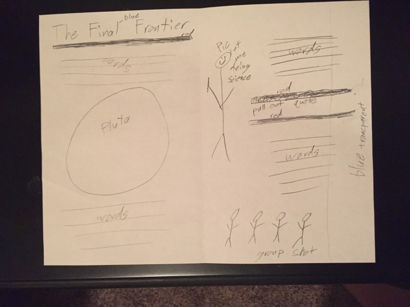
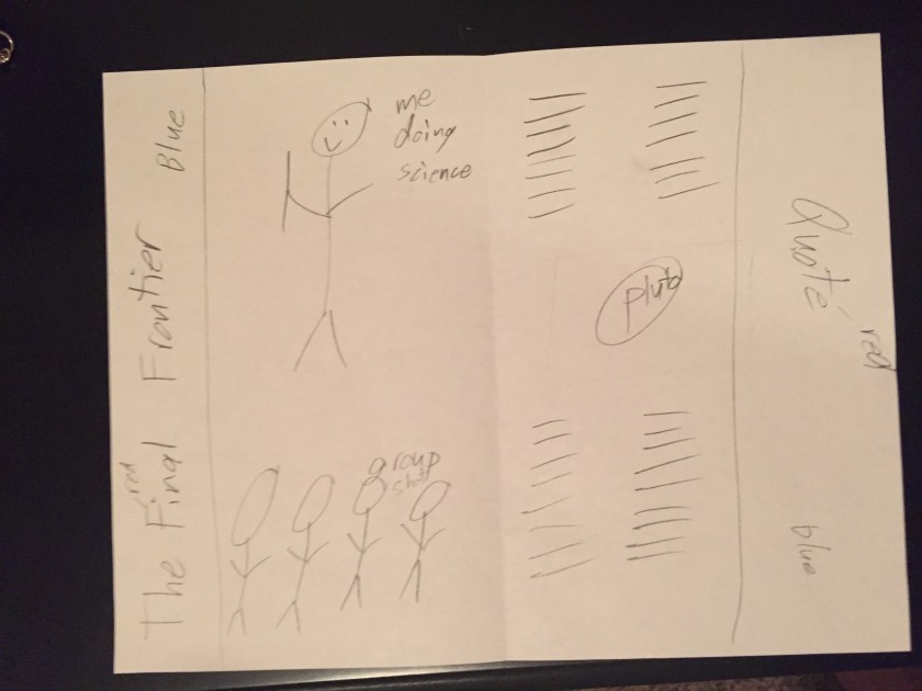
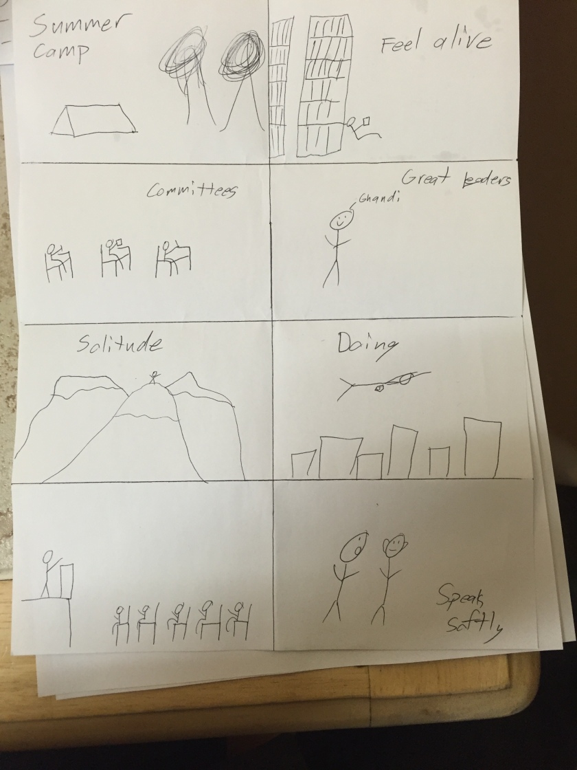
Here are some sketches (top is my favorite):

IMG_3315

IMG_3314

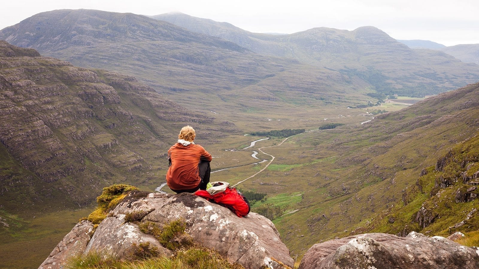
Here are the Images I am planning on using:
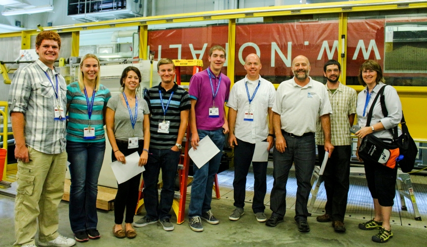
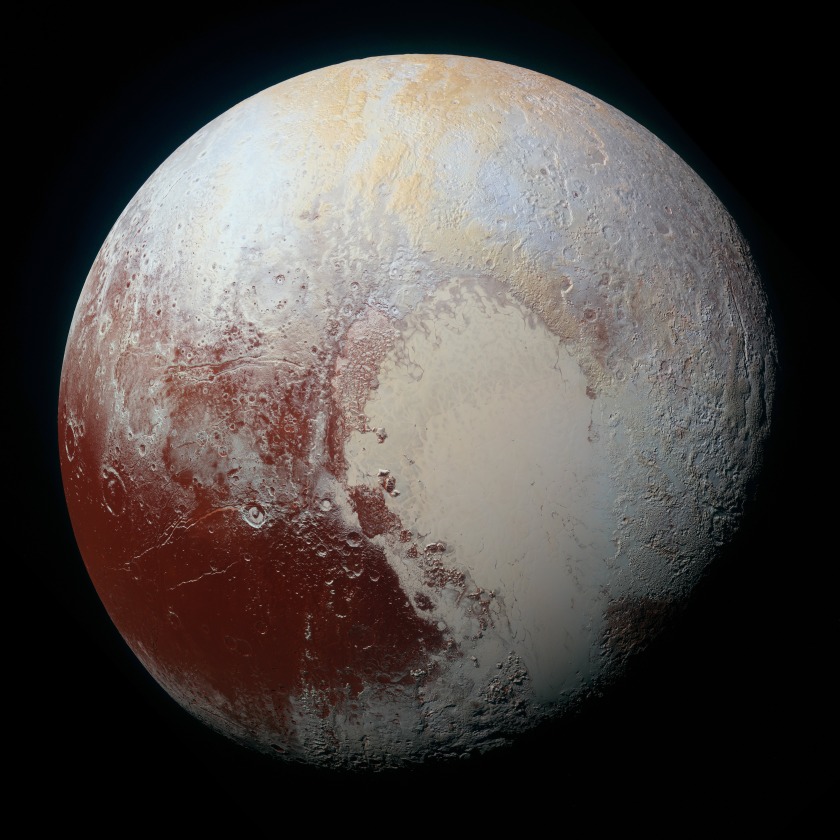
isas1_16 (6)

pluto

edit_184

Image sources:

Pluto- http://www.nasa.gov/image-feature/pluto-dazzles-in-false-color

Pics of me- https://www.facebook.com/Idaho-Science-and-Aerospace-Scholars-163878680351541/ 

Slide Design

Speakers outline: The Power of Introverts

By. Susan Cain

February 2012

Summer Camp

  • Thought they would read books
  • Rudely awaken

Introverts, what are they?

  • Feel alive when they are alone

Classes are different

  • Pods v rows
  • Committees

Famous Introverts

  • Eleanor Roosevelt
  • Gandhi
  • Rosa Parks
  • Made changes
  • Great Leaders
  • Didn’t want to lead, but had to

Best thinkers

  • Share Ideas
  • Solitude is key
  • Getting away

Western Society

  • Doing over thinking
  • Small town to city

Grandpa

  • Rabbi
  • Had to close street
  • Kind Heart

Calls to action

  • Get rid of group work
  • Go into the wild
  • Look in suit case
  • Speak softly

Process:

I started by thinking of a speech to use. In high school I did speech and debate so I was trying to think of one of the speeches I had down or heard that would be good for this project. Nothing really stood out so I went to TED and looked at their top 20 post played talks. The power of introverts stood out to me because I had heard about it before. I listened to it and made an outline that is below. The message is that being an introvert is ok. The audience is mostly geared towards introverts, but it also tells extroverts that they should do whatever makes them feel the most alive. I took the words that stood out the most and the sketches that I had made and headed over to google to find some pictures. I decided that I wanted the pictures to be full bleed so I made the words work with that.

sketches

Draft Critique:

On Facebook I was able to hear from Chance Merrill and Christine Settles. Chance suggested that I add some more color to the titles, which I did and I love it. Christine said that I should try and change my slide of Gandhi because it was a blurry. I have learned that finding a picture of Gandhi that isn’t pixilated is very hard!! I finally found one that I liked so I changed it out and I’m happy with how the slide turned out. Brent did the critique and he suggested the same things as Chance and Christine did. He also said that I should change my last slide so the words weren’t so close to the girls head. So I changed that so there wasn’t such a tangent.

Link to talk:  http://www.ted.com/talks/susan_cain_the_power_of_introverts?language=en

Font: Arial Black, San Serif

Links to pictures: Tent, Library, Classroom, Gandhi, Mountain, Superman, Preacher