Event Flier

5ACardstonstanford-page-001

Here is the word screenshot:

word screen shot

Process: Well the process this week was a bit crazy. I got my mission call so that has kind of controlled my life this week so I threw this together and the rough draft was awful. (I’m going to Paris, France on my mission btw). So I promise I’ll be done with football as soon as the Super Bowl is over, so the end of this week. I thought about how there is a really cool color scheme that the Denver Broncos use and also that on Super Bowl Sunday most Americans have big parties for the game. I combined them and this was the result. The color scheme is complimentary and my version of word didn’t give me names but they are Navy blue and Orange that I used. I threw all of the elements on in a semi decent manner and then I sent it out for critiques. After the critiques I rearranged basically the whole thing, had my mom look at it, and then converted it into a PDF and made this post. Hope you all enjoy!

Critique Process: I was fortunate enough to have Sister Esplin critique it in her videos and she told me a lot of stuff to do. The biggest thing that stood out to me is that she said to not center align it. I changed everything up so it all wasn’t aligned in the center of the page and I think it all looks a lot better. As a part of this I moved the picture of Peyton to the bottom of the page and shifted him to the right side of the page. On Facebook I heard from Karina Finke, Christine Settles, and Chris Armstrong. Karina reminded my to watch Sister Esplin’s video and to take off the “th” after the 7. Chris suggested making the logo bigger which I tried but it wasn’t by favorite so instead I added the Bronco’s Logo in the middle. Then my loving mother was the last one to look at it and she just checked over all of the spelling for me.

Color Scheme: Complimentary: Navy Blue and Orange

Font Name/Category:

Title: Gill Sans Ultra Bold, sans serif

Body copy: Garamond, oldstyle

Links to images: Manning, Bronco, Wild wings

Tasteful Typography Project

4ACardstonStanford-page-001 (3)

Here is the Word screenshot.

screen shot of word super cam


Process: As I was working on this project the first thing that came to my mind was the Super Bowl. It is just around the corner so I went to google and found a picture of one of the starting quarterbacks. I wanted the message of this photo to basically be “Football is awesome!” The audience is the those that are getting pumped for the Super Bowl Sunday that is just weeks away. As I started making the actually project I placed the image on the word document and I actually had to stretch it out a lot to make it full bleed. I looked at the Title and the body copy suggestions in Sister Esplin’s book and made sure that I had two that would look good together. When I added the lines to the page I tried to line them up with the P to make it have a nice mesh, but it wouldn’t work. I tried moving the line and moving the words and resizing it all and nothing worked!! I finally just gave up. After looking at my critiques and making a few changes I saved it as a PDF and then made it a JPEG. I hope you like it!!

Critique Report: I was fortunate enough to get a lot of great feedback. My English teacher mom proof read it for me which was super nice. I was able to connect with a lot of our class on Facebook and get feed back there. Chis Armstrong from our class suggested using silver for the body copy, which I tried but didn’t like as much as the white. Chance Merrill and Christine Settles, both from our class, suggest I move the line under the Super Cam. I did end up moving the line and I like how it turned out. On I-Learn Kaylynn Harrison said that I should add some more padding to the edges. That also helped it look a lot better. Sister Esplin looked at my project twice so it could be an example to the class. On Facebook she said I need more padding on the edges. She also said that I should move the text to the left side of the page to improve the flow. The last critique that she gave me was that I needed more repetition in the the elements so I underlined the body copy too.

Images: ESPN

Font Name/Category: 

Title: Gill Sans Ultra Bold, sans serif

Body Copy: Garamond, oldstyle

Gestalt

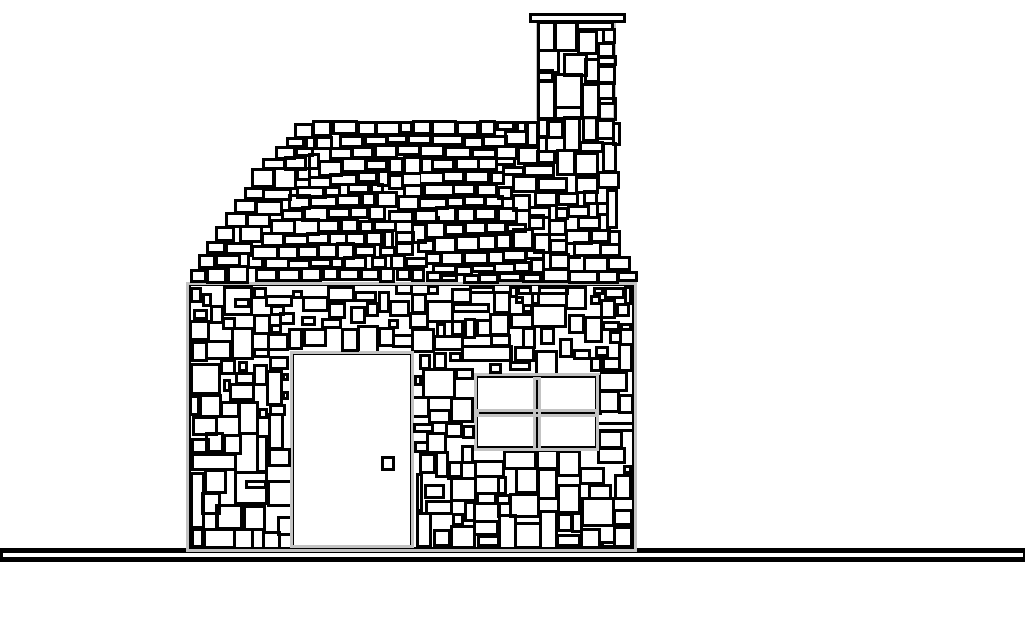
As I started working on this project, I wasn’t sure what to do. I started thinking of things I could draw and a house came to mind. I feel that a house is a great example of a Gestalt since a house is so much more than the sum of its parts. I thought of the square/rectangular shape of bricks and I decided that that could be a good way to create by house. I started out by making a big box on the outside to create a basic shape. I decided to do the boxes in a very sporadic way rather then putting them in neatly. Even with placing them at crazy random places all of the small squares were able to create a much bigger picture.